You’ve got leadership buy-in on your Product Blueprint.
With that alignment in place, you’re ready to move into the third piece of the puzzle. This is where The Solution Design begins.
The focus now shifts from understanding the problem to designing a solution that teams can align on.
The most effective way to start this phase is with low-fidelity wireframes.
In this post, I’ll walk through what low-fi wireframes are, why they matter, and how to create them with your design team.
What is a low-fidelity wireframe?
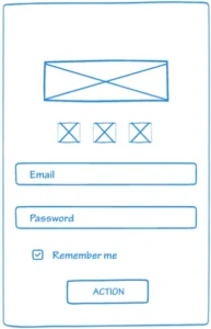
A low-fidelity wireframe (often called a low-fi wireframe) is a rough sketch of a website or app interface.
It’s a simplified version of the final product that focuses on functionality rather than visual design.
Low-fi wireframes include only the basic design elements: boxes for images, lines for text, and simple shapes for buttons.
Here’s an example of a low-fi wireframe:
You wouldn’t build a house without blueprints, right? Low-fi wireframes are your blueprints.
Why do low-fi wireframes matter?
Low-fi wireframes help you communicate your solution clearly before investing in final designs.
They help in three ways.
1) Communicating with engineering
Wireframes help you understand technical feasibility early.
Before leadership sees final designs, you want to know whether the solution is even possible to build. Engineers can spot technical constraints quickly when reviewing wireframes.
2) Communicating with leadership
Wireframes make alignment easier.
Before leadership sees final designs, you need to know if the solution can be built. Engineers spot technical constraints quickly when reviewing wireframes.
3) Communicating with designers
Wireframes make it easier to iterate.
They’re quick to edit, which allows you to test ideas and change direction before committing to final designs.
Understand your app’s structure and user flows
Before working with designers on wireframes, you need to understand how your app is structured and how users navigate it.
You need to know where the feature you’re building will appear and how it affects existing flows.
We’re building a feature that allows private banking clients to contact their relationship managers. Most of their banking interactions happen through their relationship managers, so the feature needs to be visible as soon as clients open the app.
Based on the data, HNW clients primarily use the mobile app over desktop. So we’re building this feature for mobile first.
On mobile, that means putting the feature on the main screen where it’s immediately visible. You get there by mapping the core flows and understanding where clients start their journeys.
Without a clear understanding of your app’s structure and flows, it’s hard to know where a feature fits.
Before you start wireframing, map out the critical flows of your product.
Ask yourself:
- Where is the entry point for this feature?
- How does it fit into existing screens?
- Does it replace something, or add to what’s already there?
Don’t worry about technical implementation at this stage. Your goal is to understand which screens and flows need to include the feature.
How to design low-fi wireframes with your design team
Step 1: Provide context with the Product Blueprint
Walk your designers through the Product Blueprint.
This gives them full context. They understand who they’re designing for and which customer problems the solution needs to address.
Step 2: Set expectations on fidelity
Tell them this is a low-fi wireframe. It doesn’t need to be detailed.
Step 3: Explain where the feature lives in the app
Show designers where the entry point for the feature will be.
In our case, clients want to contact their relationship manager as soon as they open the app. That places the feature on the main screen, not three levels deep.
Be specific. Show them the existing flow and explain how the feature fits into it.
Step 4: Translate problems into design requirements
Once you’ve shared the blueprint and explained the context, break the problems down into design requirements.
Here are the two most critical problems:
- Unable to reach the relationship manager when they’re away
- No visible or empowered backup ownership
We identified three problems earlier, but these two matter most. They prevent clients from reaching their relationship manager when it matters, which directly drives churn.
Trying to solve everything at once leads to feature creep. It’s better to focus on the core problems first, before adding options that complicate the experience.
With that prioritization in place, we can translate each problem into design requirements.
Problem 1: Unable to reach the relationship manager when they’re away
The wireframe should include:
- A clear option to call or email the relationship manager directly from the app
- An indicator showing whether the relationship manager is available or away
- A photo of the relationship manager so clients know who they’re contacting
Once the problem is translated into design speak, move on to the next one.
Problem 2: No visible or empowered backup ownership
Relationship managers in private banking are supported by an internal support team. This team takes work off the RM’s plate by triaging requests, preparing documentation, and managing follow-ups, so the RM can stay focused on client relationships and advisory work.
From the client’s perspective, this support should remain invisible.
High-net-worth clients expect a single owner for their financial relationship. Exposing internal support teams introduces multiple points of contact and breaks that sense of ownership.
That principle should guide the design.
Clients are already calling and emailing their relationship managers. The app needs to support both options and ensure client requests don’t stall when the RM is unavailable.
For email, messages sent through the app should copy the internal support team, so client requests don’t stall when the RM is away.
Calls need a similar fallback. There are two practical options.
1) Option A: RM call forwarding (best experience)
Calls go directly to the RM when they’re available. When they’re not, calls are routed to an internal support queue.
From the client’s point of view, nothing really changes. It’s still one number and one simple flow.
2) Option B: Call-to-message fallback (simpler)
If the RM doesn’t answer, voicemail directs the client to email the RM through the app. That email is automatically copied to an internal support team that can respond if needed.
In both cases, the client continues to contact the RM. The internal support team remains invisible.
From problems to wireframes
You’ve walked your designers through the Product Blueprint. You’ve set expectations that the wireframes can be simple. You’ve shown where the feature fits in the app and broken the problems down into clear design requirements.
Now designers can start wireframing.
The wireframes will focus on the two problems driving churn—showing how clients can contact their relationship manager when it matters, while keeping the internal support team invisible.
Once the wireframes are ready, share them with engineering managers and architects. They’ll confirm whether the proposed flows can be built and identify any technical constraints. This review happens before the wireframes go to leadership.
Next Article: How a Fintech App Screen Actually Gets Built